Lifetime Risks are Lame – Let Me Count the Ways

Along with the 2007 announcement from the American Cancer Society proclaiming that women at high risk for breast cancer should be screened with MRI came an unfortunate by-product – the golden calf of LIFETIME RISKS.

My choice of “lame” is not without some thought, the implication being that one can still walk if lame, but it can be a struggle.

The often-ignored definition of risk assessment is the calculation of “absolute risk over a defined period of time.” The problem is: “lifetime risk” is poorly defined. There is a world of difference between cumulative lifetime risk (what many conceptualize) and remaining lifetime risk (what the models actually calculate).

In addition, the certainty about the power and persistence of risk grows less and less over time. Many of our lifetime risks are simply linear extensions of shorter studies. For instance, the Tyrer-Cuzick model will calculate almost 70% lifetime risk when a 35 year-old is diagnosed with LCIS, but most follow-up studies are limited to 20 or 30 years. No cohort of LCIS patients has been published with a mean follow-up of 50 years, which is what the T-C model is calculating in a 35 year-old.

Then there is the question about calculating lifetime risks to identify patients to apply screening technology that is unlikely to be in use in 50 years. And the bigger question is whether or not screening for breast cancer will be required at all in 50 years. Eventually, with an effective “cure” for all stages of disease, there will be no need to screen.

Lifetime risk calculations are not without serious hazard. By generating high numbers (esp. to get insurance coverage for MRI screening), there are some women who will “jump ship” and move ahead toward preventive mastectomies based on inflated figures. Lifetime risks have the curious tendency of “piling up” and weighing the patient down as if the entire load is going to come spilling down on her “any day now.” The addition of SNPs to risk modeling has the potential to make that scenario more common, with inflated values for risk that have never been prospectively validated after consolidation (grouping individual SNP risks into a whole).

I was challenged to learn more about risk assessment in 1991 by Dr. David Page who cautioned back then: “Limit risk assessment to a 20-year maximum calculation” (for all the reasons above). It took many years to fully understand this sage advice, now applicable to my longstanding criticism of our MRI screening guidelines.

Admittedly, it was a stretch for the American Cancer Society (ACS) to endorse MRI without mortality reduction data (and with relatively small studies), but they correctly understood that proof of a mortality reduction by adding MRI to mammography would be difficult to come by within a reasonable time frame. Here we are, 11 years later, still with no mortality reduction data for MRI screening, a benefit that will only be confirmed through a prospective, randomized trial.

At the same time, there was incontrovertible evidence that MRI was detecting many more cancers than mammography (double to triple the number). Without confirmation of a mortality reduction for MRI, the next best thing is the surrogate of Sensitivity. (Specificity only addresses the practical aspects of screening, not mortality reduction).

Invoking deductive reasoning, the syllogism works something like this:

Major Premise: Early detection with mammography reduces breast cancer mortality by 20-30% with only 40% Sensitivity, indicating that breast cancer biology is quite vulnerable to early detection.

Minor Premise: Screening MRI has a 90% Sensitivity, and Sensitivity and Biology are the only variables involved in mortality reduction.

Conclusion: Screening MRI will result in a mortality reduction well in excess of what is achieved with mammography alone.


Had there not been the foundation of a proven mortality reduction with screening mammography, then a proposal to screen with MRI would have floundered. And if you winced while reading the “40% Sensitivity” for mammography, I did not pull that out of thin air. In fact, that’s the sensitivity level for mammography when compared to MRI in the combined analysis of 5 international MRI screening trials. (Sardanelli F, Podo F. Eur Radiol 2007;17:873-887). If you don’t like this 40%, the ACS weighed in as well, basing their recommendations on 6 international trials (the 5 above plus one more) wherein mammographic sensitivity ranged from 16% to 40% (Saslow D, et al. CA Cancer J Clin 2007; 57:75-89).

So, going out on a long limb, the ACS opted to create guidelines for patient selection that approximated how 6 international MRI screening trials had been designed. And that’s when the problems began. Relying on the strategies used for patient inclusion in those trials laid a faulty foundation. The MRI screening trials were not focused on ideal patient selection, but on proving the benefit of MRI. Lifetime risk was the norm for all studies. This skews the experience to favor younger women where lifetime risks are higher, based on the key word – remaining.

All our mathematical models calculate remaining lifetime risk, not total cumulative lifetime risk. As we age, we “pass through” our various risks, until we finally meet up with that 100% risk of death, wherein the remaining lifetime risk for any new disease is finally 0. Thus, lifetime risks DECLINE over time, while short-term breast cancer incidence INCREASES over time.

By focusing exclusively on empirical data to the exclusion of rational thought, we got our risk strategies perfectly backwards. Consider tamoxifen prevention. Entry requirements for the NSABP P-01 trial were based on short-term risks even though the effect of tamoxifen is durable over the long-term. Here, we should be using 20-year risk calculations, but by sticking to guidelines that duplicate P-01, we use 5-year risks primarily. In contrast, with MRI screening – where we want to know the probability of a mammographically occult cancer in the short-term, specifically on a given day – we use long-term risks that lamely reflect the chance of a cancer being found on an MRI in the short-term.

Granted, when we use lifetime risks, we are increasing cancer detection rates (CDRs) over the long term due to the higher rate of disease incidence. And if we were using MRI to screen only BRCA-positive patients, a substantial difference in CDRs would exist. But when we move down to the 35 year-old at 21% lifetime risk for breast cancer vs. the 35 year-old at 12% general population risk, the difference between CDRs over the next 20 to 30 years is negligible. This is what keeps “precision screening” from being precise. When you convert risk levels to the actual differences in yield, there’s really not that much difference between high risk and normal risk, with the exception of patients at “very high” risk.

Even the initial prevalence screen in high risk vs. baseline risk does not generate as much difference in CDR as one might expect. Check out the prevalence screen data from Dr. Christiane Kuhl’s MRI screening study in the general population (Radiology 2017; 283:361-370) – it’s a comparable CDR on that first screen (22.6 per 1,000) to what one finds in the high-risk international screening trials (i.e., 22, 22, 23, 29, 30 and 36 per 1,000).

Returning to the main reason lifetime risks bomb when put into practical use – the impact of age on remaining lifetime risk – let’s walk through the two different ways in which “lifetime risk” can be conceptualized:

The oft-quoted “12% lifetime” is total risk over the course of an entire lifetime, from birth to age 90 or beyond. This is a cumulative lifetime risk. (And if we take away those women with known risk factors for breast cancer, it’s not 12% — but more like 7% to 8%.) However, this is NOT what the mathematical models calculate. All models calculate remaining lifetime risk, which is directly related to the patient’s age, that is, the remaining number of years anticipated.


powerpoint #1


In the diagram above, the top graph demonstrates how we tend to conceptualize lifetime risks where the solid line indicates lifetime cumulative risk for the general population (12%), starting at age 20, with the patient icon at the end of that long accumulation. The dotted line below the solid one represents the “lifetime risk” that a 60 year-old is facing for her remaining years (7%). These cumulative lifetime risk graphs are deceiving in that one senses a persistent rise in risk over time. In reality, however, the lifetime risk as viewed with the patient icon looking forward in time (bottom graph), reveals that remaining lifetime risk is actually declining.

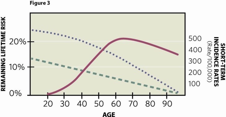
But that’s only the first step in clearing the confusion. Once you realize we’re talking about a declining number over time, how do you reconcile increasing short-term incidence for breast cancer to a peak age at 55-60? I fashioned the diagram below for my book – Mammography and Early Breast Cancer Detection: How Screening Saves Lives (McFarland, 2016) – trying to illustrate why we have the paradoxical situation of high short-term risk (in terms of rate/100,000) in the face of declining lifetime risk. That is, lifetime risks are going down, while short-term incidence is rising.

Powerpoint #2


To try and explain this paradox, I used two different y-axes. The dotted lines related to the y-axis on the left represent remaining lifetime risk, the top line for a high-risk patient, the bottom line for a baseline risk patient. The solid line relates to short-term incidence with the y-axis on the right. Since there are different units of measurement for the 2 y-axes, the design was created for illustrative purposes to make the point that these two oft-quoted numbers are paradoxically at odds with each other. As one ages, their remaining lifetime risk is in constant decline, whereas the short-term incidence peaks around 55-60, then slightly declines.

As a result of this paradox, the use of lifetime risks is highly discriminatory to the older age groups (and don’t forget the net benefit of mammographic screening, in general, is found from ages 60 to 69). A young woman with risk factors can easily qualify for MRI even though her short-term probabilities of breast cancer might be low, while the older woman with the same risks and high short-term probability fails to meet the Golden Calf standard of “20% or greater lifetime risk,” according to American Cancer Society guidelines (with NCCN and others joining in later using very similar guidelines, endorsing the 20% threshold).

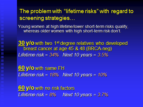
I’ve used the following example of age consequences and discrimination since 2007 in multiple publications and presentations, and it still holds true today:

Powerpoint #3


When it comes to screening MRI, the question we’re asking with selective screening is “How can we maximize cancer detection rates (CDRs) to make this cost-effective? These CDRs are directly related to disease prevalence and incidence in the screened population, and it has been the specious conclusion since 2007 that the best way to do this is through “remaining lifetime risk.” But look what happens in the example above, where the 30 y/o easily qualifies for MRI, but her risk over the next 10 years is only 3.5% (Claus model). Because the 60 y/o with the same risk factors is discriminated against through the use of lifetime risks, she fails to qualify for breast MRI even though her chance of having a mammographically occult breast cancer over the next 10 years is TRIPLE the patient who does qualify for MRI.

And in another twist of the same principle, if a 30 year-old has no risk factors other than a biopsy showing ordinary hyperplasia, the T-C model will calculate a 23% lifetime risk, which is based on 55 years of remaining risk. So this 30 y/o qualifies for MRI, while our 60 y/o in the example above with two first-degree, premenopausal relatives with breast cancer does NOT qualify? And we’ve lived with this since 2007?

In the last scenario on the Powerpoint slide above, if we look at a 60 y/o patient with NO risk factors, her 10-year risk is nearly identical to our “very high risk” 30 year-old. Yet, try to order a screening MRI on a 60 y/o with no risk factors and then watch the brouhaha that follows. Remarkably, the ACS guidelines include the specific admonition that MRI is “not recommended” for women with lifetime risk under 15% — which, through age discrimination, excludes many women with occult cancers at a short-term rate higher than younger patients who qualify for MRI. An active statement against MRI screening based on lifetime risks is emblematic of a serious misunderstanding of the long-term-short-term paradox described above.

If you ever wondered why the NSABP P-01 trial for tamoxifen prevention used “risk of a 60 y/o woman without other risks” as their threshold for inclusion – in effect, turning an average patient into a “high risk” patient – it’s because of the paradox noted above, wherein the NSABP needed quick answers so they focused on short-term incidence rather than remaining lifetime risks. In contrast, the MRI studies and subsequent guidelines did just the opposite, focusing on long-term risk to the exclusion of short-term incidence.

Here’s yet another variation on how age discrimination is an inherent feature of remaining lifetime risk: At the individual level, a woman who barely qualifies for MRI at a young age will be unqualified (or disqualified) later, perhaps within a mere 5 years. Remember, remaining lifetime risks decline over time. And if you’re not updating previously calculated risk every 5 years or so, then you’re quoting a number higher than reality allows. 100% of our patients have declining lifetime risks, and it takes some effort to recalculate those risks periodically. I try to do this every 5 years, though I still encounter patients whose risk calculation is fossilized.

Example: Take the typical patient with one first-degree relative with breast cancer, her mother diagnosed with breast cancer at age 60. When the patient is age 40, the Tyrer-Cuzick model will calculate a 22% lifetime risk for breast cancer, qualifying her for screening MRI. But as time goes on, and the patient reaches age 55, just at the point when short-term incidence is peaking (and closing in on her mother’s age when diagnosed), she has passed through enough risk that the T-C model now calculates 18%. Too bad. No MRI.

In the ACS publication that announced the 2007 guidelines, Table 4 shows the fairly wide variation from one model to the next, using 5 different risk scenarios applied to the “preferred models” as advised by the American Cancer Society (BRCAPRO, Claus, Tyrer-Cuzick). The variation is concerning, yes, but here’s the kicker – All 5 clinical scenarios begin with the patient (or proband) being 35 years old. Why wasn’t there a Table that showed the much wider variation imparted by different age groups? Did the authors consider the difference between “cumulative” and “remaining?” Or, were they so fixated on the starting age for MRI screening, they forgot that many women enter high-risk programs at 50 or older, when the incidence peaks (and where it is harder to qualify for MRI)?

How difficult is it to fix the problem? Even though countless women have been denied breast MRI for the past 11 years due to age discrimination imparted by the faulty guidelines, the “fix” is so simple as to defy logic as to why it has not been done already (new guidelines are due any day now, I’m told). You simply add the option of a short-term risk calculation in addition to the lifetime option. Introduce a 5-year risk number and the problem is fixed (unless the threshold is too high).

As it stands now, we have patients qualifying for MRI but not SERM risk reduction, while others qualify for SERM risk reduction but not MRI. That makes no sense. “Here, take this pill every day for 5 years after reviewing the long list of side effects, including death from DVT….but sorry, you’re not at high enough risk to qualify for MRI screening.”

The trial design of ACRIN 6666 indicates that there are “some out there” who understand that CDRs are boosted through the use of both short-term and long-term risks, the former designed for older women, while the latter for younger women. It’s the only way to handle the paradox of short-term vs. long-term risk. In the ACRIN 6666 trial of screening ultrasound (with a subgroup also getting screened with a single MRI), patients had to have breast density (a complex definition) as well as a single risk factor in addition to the density. The single risk could be a Gail calculation of lifetime risk…..or a 5-year Gail calculation.

Trial design took place prior to widespread adoption of the T-C model, but the rationale used displayed a deep understanding of how to improve yields based on equitable criteria. For instance, the requisite degree of risk was lessened as density increased. Think about it. Two parameters – risk and density – intimately bound when the endgame is the probability of a mammographically occult cancer. Like the high risk patient, the high density patient is more apt to have a mammographically occult cancer than a low density patient. So when the density level is higher, the requisite risk level was relaxed in ACRIN 6666. It’s rational and insightful.

We are doing something similar at Mercy Breast Center in OKC in a NCI-funded study of 4,000 normal mammograms (NCI R01CA197150), using a computer analysis system with machine learning that converts density patterns to a Risk Score, comparing left to right, and year-over-year, a computer program developed by Drs. Bin Zheng and Hong Liu at the University of Oklahoma Advanced Cancer Imaging Lab in Norman. We use a sliding scale, wherein a Risk Score of 0.80 prompts a screening MRI, but if density is Level C, then a score of 0.75 qualifies, and for Level D, a score of 0.70 qualifies.

When the 2007 guidelines for MRI screening were released, there were so many inconsistencies and oddities, I assumed that corrections and modifications would be prompt. That has not been the case. As noted above, the guidelines were largely dependent on the international trials where the focus was on MRI performance, not risk assessment strategies. In fact, if you read the inclusion criteria of the international MRI screening trials, it’s not always clear in some of the studies how patients were selected.

In our 2014 publication that challenged current guidelines for MRI screening (The Breast Journal 2014; 20:192-197), we performed risk calculations using Gail, Claus, and Tyrer-Cuzick on all patients who had their cancer discovered through routine asymptomatic screening with MRI. Most of our MRI discoveries would have never happened had we relied on the ACS guidelines due to the fact that we had incorporated breast density levels into patient selection. This point system was first proposed prior to the 2007 ACS guidelines, although not in print until 2008 (Hollingsworth AB, Stough RG. Breast MRI screening for high risk patients. Semin Breast Dis 2008; 11:67-75.)

At the time when we introduced our point system (2008 in print, 2004 first use), we had only diagnosed 7 patients with MRI screening. None were identified with the Gail model, none with Claus, and only 3 of 7 with Tyrer-Cuzick. The impact of using breast density as an equal parameter to calculated risk was apparent to us early on. Our strategy also took into account the wide variation in the different models (by not relying on their illusion of certainty) and avoiding the paradox of declining lifetime risk in the face of rising incidence by simply placing patients in one of 3 risk level categories: Baseline Risk, High Risk and Very High Risk.

This might seem reactionary, but I’ve never fully embraced the mathematical models. Why? Their merging of risk factors is based on accepted statistical modeling applicable to industry in general, but with no accounting for the biologic interaction between risks. As such, the Gail told us that Atypical Hyperplasia and Family History were synergistic, consistent with the original work of Page and Dupont. But then (with the blessing of Dupont) the Mayo Clinic data now indicates that family history contributes nothing in this situation – the risk of Atypical Hyperplasia trumps family history and imparts the same level of absolute risk regardless of other factors. On a bigger scale, this is biology trumping mathematics.

And to support my skepticism of the mathematical models, look at the c-stats for the various models that reflect “discrimination” at the individual level. They’re not pretty. Better than flipping a coin, but nothing to brag about and well below predictive models in other diseases. The c-stats are comparable to “accuracy” in the statistical sense, and while the original Gail had an embarrassing 0.58, we’re still not above 0.70 with the latest and greatest models. Yes, you might see the word “excellent” associated with various models, but they will be talking about “calibration,” not discrimination. Calibration is the predicted-to-observed ratio, that is, how many cancers will develop in a cohort. And therein lies the unequivocal benefit of mathematical modeling – that is, in the design of clinical trials where investigators need to predict the number of breast cancers that will occur. But at the individual level (discrimination), not so good.

It is probably no surprise that I still like my original scoring system more than any other option. With 4 levels of density and 3 levels of risk, we generated a total that converted to a recommendation of 1) annual MRI, 2) biennial MRI, 3) triennial MRI, or 4) No MRI. In this model, patient age has no impact at all on selection for MRI. As a result, the age distribution in our MRI-discovered cancers closely reflects age-at-diagnosis in the mammographically screened population – that is, 80% of our MRI-discovered cancers are in patients over the age of 50.

Powerpoint #4

By the time of our 2014 publication, we had diagnosed 33 patients with MRI screening. Had we used the Gail model, only 9 of 33 cancers would have been discovered. Had we used the Tyrer-Cuzick model (where calculations are consistently higher), still only 12 of 33 cancers would have been discovered. And poor Claus – originally, the “preferred” model as it was the only model used in the international trials (of the 3 that used modeling) – here, only 1 of 33 patients would have qualified for MRI screening. Using all 3 models and opting for the highest calculated risk, and adding BRCA positivity, we still would have identified only 16 of 33 cancers (48.5%) in this loose interpretation of ACS guidelines.

Clearly, there are problems with the current guidelines. And it’s really quite simple – if you are going to use a second line of defense (MRI, in this case), then its use ought to be predicated on the probability that the first line of defense is going to fail. That first line is mammography, and the probability of failure is based entirely on breast density. Using risk factors alone (without density) to select patients for MRI screening does not address that first line of defense in any fashion whatsoever, an incomprehensible deficiency.

In fact, even though risk and density were equally weighted in our 2008 “point system,” one can make the case to jettison risk calculations entirely, and base MRI screening on density levels alone. Witness what is going on in The Netherlands with the DENSE Trial of MRI screening. This is a prospective, randomized trial of mammography every 2 years versus mammography plus MRI every two years in women aged 50 to 75 (over the course of 3 screens), using a single entry criterion – Level D density.

 Risk levels have been tossed out (other than the inherent risk of Level D mammograms) and the entire study is predicated on the idea that this group of patients will harbor a substantial number of mammographically occult cancers (comparable to the yields in the high risk MRI screening trials). If the ACRIN 6666 subgroup that underwent a single MRI is any indicator, the Dutch will generate a landmark study that, by the way, includes mortality reduction as one of the endpoints.

I began this blogatorial with the intent to focus on the paradox of long-term risks versus short-term incidence, but before I knew it, I had slipped into my chronic, ongoing rant about the treatment of mammographic density as some sort of isolated risk factor that “needs more research” in the 2007 MRI screening guidelines.

But there is so much more in the current guidelines to whine about – such as the disconnect between risk of breast cancer and risk of gene-positivity (addressed by Kevin Hughes, MD and his team in Cancer 2008; 113:3116-3120). Then, there’s the odd approach to tissue risks by the ACS wherein suddenly “lifetime risk” with ADH/ALH/LCIS is tossed out the window and the risks are described with short-term values, such as “12-year follow-up.” So, a young woman at 40% lifetime risk after a diagnosis of ADH does not qualify for MRI while the same woman at 21% lifetime risk due to family history will qualify (thankfully, peer reviewers don’t follow the letter of the law, and the ADH patient will usually qualify.) This is a good thing. We are now up to 52 MRI-discovered cancers, and ADH was the dominant risk factor in 12 of the 52.

Okay, I’m clearly rambling now, and the next thing you know, I’ll be discussing the exclusion of patients with prior breast cancer in the “needs more research category” where I guess we’re supposed to be comfortable with 40% sensitivity for mammography.

The revised MRI screening guidelines – 2nd Edition – were targeted for release several years ago, and I’m not sure what happened. When the ACS released their revised mammography screening guidelines for the general population in 2015, it was stated that the high-risk guidelines would be next. I can’t complain that I didn’t get the opportunity to make my case. Although no one invited me to the party that will decide the new guidelines, I did have the opportunity at a committee meeting to chat with one of the key policymakers at the American Cancer Society who will be guiding the new recommendations. As I discussed the age discrimination problem, it was clear that all the ramifications of our current system had not been considered the first time around, especially as pertains to remaining lifetime risk.

So, we await the new guidelines. After what I’ve seen so far, given the precious few who have devoted careers to the nuances of risk assessment, I’ve got to raise this skeptical toast to the policy-makers: “May you not make things worse than they already are.”


Invasive Lobular Carcinoma Doesn’t Make the Grade

invasive-lobular-carcinoma


The use of histologic grading in breast cancer is a time-honored tradition grounded in decades of controversy. To wit…

Bloom-Richardson (1957) duked it out with Black (nuclear parameters only), then Scarff and Torloni added their modifications in 1968, which then became the Scarff-Bloom-Richardson system (Torloni apparently didn’t make the cut). Then, in 1991, Elston-Ellis weighed in with their modification of Scarff-Bloom-Richardson, and while this was “abbreviated” for a while as the Elston modification of Bloom-Richardson, we are all thrilled that, instead of the rambling “Elston-Ellis modification of Scarff-Bloom-Richardson with a nod to Torloni,” we can rest in the diminutive institutional eponym – the Nottingham Grading System.

Having witnessed the 1991 Elston-Ellis modification (now Nottingham), it was “peace at last” as both reproducibility and reasonable prognostic information were confirmed…at least to an acceptable degree at the time (What pathologist doesn’t waffle between Grade 2 & 3 on occasion?)

Tubule formation, mitotic count and nuclear pleomorphism – three headers, each generating 1 to 3 points. When the 3 scores are added, Grade 1 totals 3-5, Grade 2 is 6-7. Grade 3 is 8-9.

Left out in the cold, however, with the adoption of the Nottingham system was invasive lobular carcinoma (ILC). By definition, the histology of ILC does not allow tubule formation as a feature. So, a low grade ILC gets penalized with 3 points before one ever gets to the true distinguishing features – mitoses and nuclear pleomorphism. This creates the bizarre situation wherein invasive ductal grading starts with a minimum total of 3 points, whereas an ILC (a slightly more favorable histology) starts with a minimum of 5 points, ready to leap into the Grade 2 category. One simple, subjective, slip-up here (a 2 for either mitoses or pleomorphism), and you’ve turned a truly Grade 1 cancer into Grade 2 with a total score of 6.

Note that the long-discredited Black Grading System is custom-made for ILC, as the Black system does not count tubule formation in the first place. In this era of software medicine and synoptic reporting, most pathologists reluctantly comply and slap a “3” onto ILC from the git-go due to the lack of tubule formation, rationalizing that it really doesn’t make that much difference. And in this era where systemic treatments are based on other markers, this appears to be correct.

Some pathologists prefer the purist approach and will avoid grading ILC using the Nottingham system altogether, while others have taken an active stance of resistance, pointing out the need for a 2-tiered system applicable to ILC only (e.g., Adams Al, et al. Histologic grading of invasive lobular carcinoma: does use of a 2-tiered nuclear grading system improve interobserver variability? Ann Diag Pathol 2009; 13:223-225).

In general, however, most go with the flow, and as stated in one major medical center’s guidelines for pathologists – “Although classic lobular carcinoma by definition is scored as 3 for lack of tubule formation, cases will receive scores of 1 for nuclear pleomorphism and the mitotic count will usually be low, resulting in an overall score of grade 1.” Not quite – I’ve seen (in print), the remarkable claim that “classic ILC is a Grade 2 tumor,” demonstrating how error can disguise itself as the norm. In fact, classic ILC has cells that are so bland they can appear to be lymphocytes, such that the slightest pleomorphism can add the dreaded 2-point burden, thereby converting a Grade 1 to Grade 2. When I reviewed our classic invasive lobulars for the past 3 years, it was an even split – half were Grade 1 and half were Grade 2. From the biologic standpoint, and if put on equivalent footing with ductal, nearly all would be Grade 1.

(As an aside, I still hear comments that “invasive lobular is more aggressive than ductal,” which is not the case. Instead, ILC is much more likely to be missed on clinical exam and mammography such that we often encounter insidious, advanced stage tumors. The clinical impression comes from delayed diagnosis, not inherent biology…with the exception of pleomorphic lobular.)

To be fair, one rare variation of ILC forms tubules – a tubulolobular. As a result, nearly all tubulolobulars will end up as Grade 1. However, the other variants – classic, solid, mixed and alveolar (pleomorphic addressed below) – have no tubule formation whatsoever as part of the diagnostic criteria.

In fact, most prefer to call tubulobulars a distinct histologic sub-type rather than an ILC variant. In this scenario, the next step up in Grade will yield a diagnosis of “ducto-lobular” or “mixed ductal and lobular” with a variable e-cadherin pattern just adding to the confusion.

Until recently, the issue of flawed grading in ILC rarely altered therapy, so “who cares if we practice sloppy grading?” After all, treatment is based on tumor size, nodal status, ER/PR, HER2, and multi-gene panels.

But in January 2018, the AJCC announced version 8.0 of the breast cancer staging criteria, and with one fell swoop, histologic grade (formerly a distinct “marker”) was merged into the staging system. Finally, I thought, this serious defect in a grading system for ILC will get some attention and be corrected. If not, then we’re going to have a faulty grade convert to a faulty stage which converts to faulty therapy.

So, the first thing I did when I finally figured out how to calculate 8.0 Stage was walk through all possibilities using Grade 1 versus Grade 2, as this is where aberrant use of the Nottingham system for ILC will hurt – converting what should be Grade 1 to Grade 2. Amazingly, there were no alterations in Stage! Be it Grade 1 or Grade 2, the Stage was the same.

This was not true for Grade 2 vs. Grade 3 where one can demonstrate some differences imparted to Stage, but this is toward the pleomorphic ILC end of things where overtreatment is unlikely to occur. For an ILC to receive Grade 3, even with tubule formation getting penalized to a 3, mitotic count and pleomorphism have to add up to 5 or 6 – by definition, not “classic” ILC – and by then, the alert will sound that this is “pleomorphic ILC.” Here, the resultant higher stage supports the need for aggressive systemic therapy.

The tougher issue, addressed herein, is whether or not the 3 points for “no tubules” might take someone from Grade 1 to Grade 2 with an advance in Stage that prompts systemic therapy that would not otherwise be recommended. And, after all my belly-aching above, it does not appear this “over-grading” will happen with the new 8.0 staging system. Multi-gene tumor profiles make it even less likely.

So, in the end, we can all return to our deep slumber and ignore the fact that invasive lobular carcinoma is irrationally graded as a matter of routine, with a 3-stroke penalty before the game even begins.

The Premature Burial of Breast Cancer Histology

Poe

The conference room could have held 8,000, but many of the seats were empty. So I’m guessing that at least 3,000 witnesses at the 2017 San Antonio Breast Cancer Symposium heard the same presentation about triple-negative breast cancer that I did.

Investigators had discovered an unusual and unexplained finding – triple-negative cancers arising in BRCA-1 gene-positive patients had a better prognosis than triple-negatives in the general population. At the end of the presentation, curious audience members approached the microphones to question the presenter and offer scientific challenges.

The answers went something like this, no matter what the question: “We simply don’t have an explanation for our findings, so more work needs to be done on this.” No thoughts from the podium. None from the floor. Yet, the answer was easy, obvious and available 20 years ago, before this study was even conceived.

However, the answer has been lost in a frenzy of molecular biology. We no longer impress our scientific colleagues by using “old” terms that emanated from such clunky tools as the light microscope. We prefer terms like Luminal A, Luminal B, triple negative, etc., to describe our cancers being studied. Problem is, we have 50-75 years of quality information that is based on the light microscope, and those truths did not disappear just because DNA microarray was invented. Yet, histologic sub-types have become passé, even buried, prematurely.

The key word that was left out of the San Antonio presentation was “medullary.” No one mentioned it, and I wouldn’t be surprised if some of the basic scientists had never heard of it. But when BRCA-1 was first identified, a wave of articles soon appeared revealing a disproportionate rate of medullary carcinomas occurring in BRCA-1 positive patients. Even those cancers that did not qualify for “pure medullary” met some of the requirements and were called “atypical medullary carcinomas,” again in disproportionate numbers in BRCA-1 positive women. Were they triple negative? Most of them, yes, only we didn’t use that particular phrase, even though the 3 markers were routinely tested.

Not all triple negatives are medullary (or atypical medullary), nor are all medullary cancers triple negative. But when a classic medullary was diagnosed in a BRCA-1 positive patient, it didn’t take long for researchers to figure out that the prognosis was better in these patients, consistent with the favorable prognosis in cases of medullary carcinoma in the general population. Stated alternatively, the 2017 results being presented were actually known under the guise of “medullary” 20 years ago.

In spite of their ominous appearance (the worst cytologic features anywhere in breast pathology), medullary carcinomas paradoxically have a much better prognosis than non-medullary triple-negatives. This was the missing link at San Antonio. The researchers were likely encountering medullary cancers without recognizing them as such. After all, they were focused entirely on the molecular biology of “triple negative” breast cancer using highly sophisticated DNA arrays, while the light microscope was buried somewhere in another department.

In my view, medullary carcinoma is the most intriguing histology in breast cancer, bar none. Zero glandular formation, wild pleomorphism, large and multiple nucleoli, bizarre mitotic figures everywhere, so that the tumor looks as if it might be growing in front of your eyes in spite of formalin fixation. Amazingly, these features are somehow countered by the mystery of the lymphocytes that have corralled the nests of highly malignant cells into small groups, locking them inside the tumor, so to speak.

This “corral effect” is seen at the perimeter of the tumor as well, with a sharply circumscribed, pushing border, once again as if the lymphocytes have wadded up a piece of trash into a tightly compacted ball so that no cells can escape. Oddly enough, we do not see large necrotic areas in medullary from its rapid growth (doubling times of one month have been reported), indicating the cells are held in check by lymphocytes only temporarily. In fact, there is evidence to support that notion in that the “favorable” outlook of medullary tends to wane as tumors increase in size, especially after node positivity.

Nearly 30 years ago, I recall telling medical students who rotated with me on the breast service at the University of Oklahoma that if someone can figure out what those lymphocytes are doing in medullary carcinoma, then they’ll find a cure for breast cancer. Without claiming supernatural prescience, today we have intense investigations into TILs (tumor infiltrating lymphocytes), and ways in which those lymphocytes can be activated with immune therapies.

And here’s a wild thought – what if the unusual appearance of medullary cancer is due to the host’s unique immune system, rather than the specific, pseudo-aggressive tumor biology? In such a case, one person’s triple-negative tumor is another person’s medullary carcinoma, even though both individuals have identical tumor molecular biology. In fact, medullaries routinely test as super-aggressive, using proliferative markers or whatever, indistinguishable from the profiles of other triple negatives. The difference in natural history can only be told using light microscopy.

 In my wild conjecture, the tumor morphology would be the result of the immune system, NOT the inherent biology of the tumor. If this “host” stuff sounds familiar, Dr. Bernie Fisher first proposed host immunity as being of equal importance as tumor biology in the formulation of his “alternative theory” in the 1950s. Although he was referencing all invasive cancers, perhaps medullary histology is revealing how the optimal immune response can occur naturally. (As an aside, Dr. Fisher is still living, having turned 100 on August 23, 2018.)

Today, researchers know that cancer cells have a powerful mechanism that cripples the immune system, that is, the presence of PD-L1 on the cancer cell surface that binds to a PD-1 receptor on T-cells to prevent their activation. What if a medullary is nothing more than someone’s immune system that blocks this binding, allowing the T-cells to do what they should – corral the cancer?

The lymphocytic distribution in invasive cancer was recognized over 75 years ago, with the degree of inflammatory response proposed as part of the routine prognostic information. The idea was a good one, but it didn’t quite pan out enough for clinical utility. But go to any breast cancer meeting today, and someone will be talking about TILs (tumor-infiltrating lymphocytes), or other inflammatory cells/responses that might be of critical importance in outcomes, completely separate from inherent tumor biology. DNA microarrays might turn out to be only HALF the story.

In the BRCA-1 positive population that was discussed at San Antonio, not all the tumors were medullary, of course, but it wouldn’t take many to tilt survival in favor of the BRCA-1 positive patients with triple-negative cancer, given the large prognostic edge to medullary. The remarkable feature was that the word “medullary” was never used. The only language spoken was “molecular biology.”

I’ve noticed a trend wherein pathologists rarely use histologic sub-types as the final diagnosis. Instead, a tumor will be called “Invasive ductal carcinoma, with medullary features.” Such a soft call doesn’t allow for customized prognostic information to be given to the patient. Instead, “medullary” becomes a curiosity rather than a histologic sub-type with specific, associated behavior. And with this shift in attitude, hundreds of articles on the clinical behavior of medullary carcinoma have gone up in smoke, while researchers stand at the podium, mystified at their own results.


Another example of histology denied – Tubular Carcinoma


Largely a product of mammographic screening, the use of the term “tubular” has fallen by the wayside, lying in the gutter with “medullary.” Yet, there is a large body of evidence that tells us that this tumor is different than the standard Grade 1 breast cancer. Tubulars are not simply “well-differentiated,” they are “super-well-differentiated,” so much so that even the experts have a hard time distinguishing certain benign sclerosing lesions from tubulars.

What difference does it make? Well, given a pure tubular (90% minimum surface area meets classic tubular criteria, while remaining 10% is no worse than Grade 1), if it’s under 1.0cm in size, I’m not sure anyone has ever died in recorded medical history. One publication was just ambiguous enough that I can’t be 100% certain about the 100% survival rate, but it’s no worse than 99% (better than some DCIS). As for node-positivity with a pure tubular under 1.0cm, it hovers between 1% and 2%, less than the complication rate of sentinel node biopsy and well below 10-20% node positivity seen with garden variety breast cancer of the same size. Even when larger tubular cancers spread to lymph nodes, the outlook is still remarkably good, better than your non-tubular Grade 1.

As for multi-gene tumor assays that claim to trump histology and tumor size, I would say, “Not so fast.” While the majority of tubular carcinomas score low on these assays, some tubulars make it into the intermediate range. Granted, TAILORx takes the pressure off, but if someone is contemplating chemotherapy for a classic, pure tubular under 1.0cm, I’d say, “If you can improve upon 99% survival, then have at it.”

Virtually all pure tubulars are strongly positive for ER/PR, and endocrine therapy is often employed (although for the pure tubulars under 1.0cm, the systemic benefit is close to nil, while risk reduction for a new primary might be substantial). But what if you get back a report claiming that a pure tubular is ER/PR negative/negative? Odds are that you have a quality control issue. I’ve seen a triple-negative tubular once – and when I asked pathology to repeat the study, there was groaning and complaining. This was a number of years ago when the methodology was cytosol measurement rather than IHC. But when the case was analyzed, the original values had used a piece of the lumpectomy specimen (pre-core-bx-era) that had no tumor (normal breast cells are triple-negative, after all). When the study was repeated on actual tumor, it was strongly ER/PR positive/positive.

Other explanations are out there for ER/PR being low or negative, including the “tubular” designation being incorrect (due to high grade nuclei). However, a negative ER/PR for tubular should be a red flag for a problem somewhere.

Now, once you go below 90% purity, or increase the size above 1.0cm, all bets are off. But one of the most intriguing things about tubular carcinoma is the relationship between purity and tumor size.

Tubulars are known for their small size. Given a 0.5cm tumor discovered on mammography, it’s likely to be a tubular. And that brings up one of the most important facts in the tubular literature, mostly forgotten today (though I try to resurrect it from the dead at every available opportunity) – pure tubulars morph into routine invasive ductal as they grow. Okay, maybe I shouldn’t be so dogmatic, so let me defend that statement, as the implications here are huge – not for clinical management per se, but in the epidemiologic debate surrounding screening mammography and overdiagnosis.

Let me back up. When was the last time you encountered a 3.0cm pure tubular carcinoma? For me, the answer is “Never.” In fact, pathology studies were done long ago that correlated “purity” with “size.” That is, a direct correlation exists between the percentage of tubular histology and tumor diameter. To me, the conclusion is obvious and, importantly, without an alternative explanation — as tubulars gradually increase in size (slowly at first), they become less and less “pure,” eventually losing the “tubular” moniker. So, the pathology report might not even mention tubular features once the purity drops, let’s say, below 50%. The larger the tumor, the lower the percentage of tubular features.

I believe tubulars de-differentiate over time as part of their natural history. Hard to prove, since one can’t follow a single tumor to measure purity over time. But from the studies of multiple tubulars, the trend is impressive when purity and size are correlated. De-differentiation is the pathology term for what the basic scientists call tumor “progression,” that is, malignancies becoming “more malignant” over time with additional somatic mutations. (Note: the anti-screening epidemiologists abhor the concept of tumor progression.)

Tumor progression is at the heart of the debate on “overdiagnosis” of invasive cancer, a criticism of screening mammography. One cannot measure or recognize overdiagnosis as it is happening. Its existence is theorized entirely through indirect observations. One of the most common of these observations is the “excess” number of cancers that occur in the screened population in any of the historical studies. The attempt is then made to point out that these cancers would never result in the death of the patient as they do not progress. If they did, the number of cancers in the unscreened group should eventually catch up to the number found in the screened group.

However, in spite of the anti-screeners focusing on “excess, non-progressing cancers” drudged up through mammography, their indirect calculations force the necessity of a direct observation, a critical question rarely discussed – Where do these excess cancers go in the unscreened population? There are only two possibilities, if these “non-cancers” (as they’ve been called) are not found through screening – 1) dormancy – tumors reach a certain size then stop growing, or 2) they must regress, that is, they form, but then self-destruct, so to speak, without anyone ever knowing they existed. No matter how sophisticated and convincing the indirect evidence for “overdiagnosis” might be, one still has to account for those “excess” cancers being found on mammography.

And here’s where we circle back to tubular carcinoma, an ideal candidate to label as “overdiagnosis.” Even the lowly tubular, with its indolent course, will grow over time and, with additional mutations, eventually progress into a potentially life-threatening tumor. If tubulars can de-differentiate as they grow, one has to be very concerned about any invasive cancer having the same potential. The reason a tubular can be a functional “overdiagnosis” is because the age of the patient does not allow enough time for the lesion to progress, which can take many years. (Epidemiologists try to demonstrate that there are excess cancers with screening even in younger patients, but I don’t want to digress any further in this blogatorial).

Returning to our TWO (and only two) POSSIBLE OUTCOMES for “excess breast cancers” – dormancy or regression – theorized to explain the claims of the anti-screening epidemiologists, let’s address dormancy first. If tumors form, but then stagnate and quit growing, reaching a peaceful settlement with the host, then they should be found a-plenty at autopsy. Yet, from the pre-mammographic era of unscreened women, an analysis of all available autopsy studies (Ann Intern Med 1997; 127:1023-1028) showed only a 1.4% incidence of invasive carcinoma at autopsy (range = 0% to 1.8%), a strong indictment against the concept of tumor dormancy as 1% is exactly what one would expect from a single prevalence screen using mammography. (DCIS is another matter, not addressed here.)

As for tumor regression, the idea was so outlandish that those of us at the front lines tried to brush it away. But the “overdiagnosis voices” got stronger and stronger, apparently realizing that dormancy wasn’t going to fly, so they should focus on tumor regression. After all, it’s the perfect explanation, since the evidence has “disappeared.” Yet, as any breast radiologist will tell you, “I’ve never seen a breast cancer regress on serial mammograms.”

How would they know? They know from “untreated” cancers generated by: 1) refusal to proceed with treatment after diagnosis, 2) comparisons of newly diagnosed cancers to imaging done in prior years, and 3) “missed” cancers on mammography, where the radiologist gets to see the tumor develop (grow) year-over-year.

But these cavalier dismissals of tumor regression were anecdotal and couldn’t start to influence the evidence-driven epidemiologists. Fortunately, the Society of Breast Imaging put together a formal study (J Am Coll Radiol 2017;14:863-867) to look at “untreated cancers,” that is, diagnosed by core biopsy, but then no treatment, for whatever reason. At any single facility, this sequence of events is relatively rare, so in this study, engineered by Dr. Ed Sickles, it took 42 sites to pool their data, and – lo and behold – out of 240 cases of “untreated” invasive breast cancer (and 239 DCIS cases) there was not a single case of tumors shrinking or disappearinga strong indictment against the concept of tumor regression.

 Without dormancy and without regression, “overdiagnosis” becomes a relatively rare phenomenon, exaggerated largely by failure to account for enough lead time in the historical screening studies. Yes, the elderly patient with a 0.8cm pure tubular has probably been overdiagnosed, but not due to her tumor biology, as much as her life expectancy. In contrast to the relatively small rate of overdiagnosis (5-10% is reasonable), the outrageous estimates of 50% and higher that are being spoon-fed as fact to the U.S. media are beyond the pale.

And this entire diatribe is brought forth just because pure tubular carcinoma de-differentiates as it grows. It’s always fascinating how there can be so many implications from a single, arcane fact. The bigger question, of course, is how to reconcile tumor progression as promulgated by basic scientists and light microscopy versus the undying belief in tumor regression as proposed by anti-screeners.

Returning to my primary point: With today’s research techniques and strategies, ALL pure tubular carcinomas – recognized only through old-fashioned light microscopy — are going to be tossed into the larger batch of Grade 1 breast cancers, or Luminal A cancers, where the critically important phenomenon of tumor progression/de-differentiation would never have been seen.

Yet in spite of direct evidence against dormancy or regression, empowering tumor progression as very real, this is what we hear mostly today: “This implies that many small cancers are not destined to progress to large cancers; instead, their detection results in overdiagnosis.” (New England Journal of Medicine, June 8, 2017). Epidemiologists do not look through the microscope; they only look at numbers.

This is a cautionary blogatorial — tubular and medullary are only examples. We’ve not only buried the light microscope in breast cancer research, but we’re also starting to forget that it ever existed.

Mathematical Risk Models — where Independent Risks Become Dependent

2004 risk working group

In the early 2000s, breast cancer risk assessment began to ease into the clinic, specifically for guiding SERM risk reduction strategies.  Our Komen-sponsored Working Group (above), under the leadership of Victor Vogel, MD, cobbled some guidelines together over the course of one year before publishing in 2004.  But risk assessment didn’t hit full force until the 2007 American Cancer Society guidelines were announced for screening high risk women with MRI.  (After 11 years, these high-risk guidelines are currently in the process of revision.)

WARNING: The following discussion of quasi-precision medicine is not for those faint of heart when it comes to numbers and mathematical models of risk.

In the pre-Gail days, the only predictive models were esoteric family history tables from the epidemiologic literature that were virtually unknown to clinicians. No attempt was made to incorporate other risk factors, and maybe that was a good thing.

Having started one of the earliest risk assessment programs in the U.S., pre-Gail, I leaned heavily on the Dupont tables that converted relative risks to absolute risks over defined time periods, preferably 20 years max. The problem was determining a reasonable overall relative risk (RR) when more than one risk factor was present. Anticipating this problem, investigators had begun coupling risk factors and calculating single RRs. For instance, “nulliparity plus a first degree relative with BC” carried an RR of 2.7 in one study. Plug that into the 20-year risk table from Dupont, and for a 50 year-old, you’ll get a 12% risk of breast cancer over the next 20 years (thru age 70). This calculation is a little higher than what the Gail predicts today, and about the same as what the Tyrer-Cuzick (TC) model predicts.

The best-known coupling of risk factors was “atypical hyperplasia and a first degree relative with breast cancer,” with the Page/Dupont team assigning a synergistic RR=9.0 (later nullified by the Mayo Clinic data). Although Page and Dupont introduced their seminal work in the 1970s, it was a landmark paper published in 1985 by the New England Journal of Medicine that captured the attention of what was then precious few breast specialists. Nevertheless, multi-factorial risk assessment was born.

This dual-risk approach was sufficient for risk factors in couplets, but what about 3 or more risk factors? And what about those continuums that are applicable to all, such as age?

Enter Gail (1989 publication, although common use lagged until the P-01 trial), where risks were not directly studied as couplets, triplets, or beyond. The Gail approach didn’t care about biologic relationships. Rather, relative risks (RRs) were merged into absolute risk mathematically (with multiplication of RRs being at the heart of the statistical formulas). The user never sees the RRs, only the final tally in the form of an absolute risk over a defined period of time.

Validation of the Gail came through the Texas Breast Screening Project, then from the 6,700 women in the placebo arm of the NSABP P-01 trial (then CASH validation, then NHS validation), where it was accurate in predicting the number of cancers that would occur in a large cohort (called “calibration” – #predicted vs. #observed). But prediction at the individual level (called “discrimination”)? Well, not so good. With a concordance-statistic (c-stat, which is comparable to statistical “accuracy” expressed as AUC) of 0.58, the original Gail was not much better than flipping a coin for an individual. This should not be surprising given that the majority of patients who develop breast cancer do not have the risk factors included in the Gail model, if they have any known risks at all.

After the Tyrer-Cuzick (IBIS) model emerged and bypassed the Gail in popularity (for reasons I won’t bother with here), one could easily fiddle with many more variables to see the impact that individual risks had on the final calculated risk. C-stats crept above 0.60, but realize that .70 is a minimum standard for “fairly good performance,” and it would be far better to reach 0.80 where one will find the predictive models used for diabetes and cardiovascular disease.

In order to be included in the mathematical models, risk factors must be “independent.” That is, they exert their effect with or without other risk factors. Yet, after they are merged mathematically, strange things happen biologically.

Let’s look at a patient who undergoes risk assessment with the Tyrer-Cuzick model at age 50, having no other risk factors other than her plan to take Prempro™ HRT for the next 20 years (yes, it’s an extreme example to make a point).

Tyrer-Cuzick generates a baseline risk of 11.4% lifetime that will increase to 16.3% with 20 years of intended E+P. So, the risk of E+P is an additional 4.9% absolute risk over a 35-year lifespan.

Now do the same calculations of E+P for a woman who has 2 first-degree relatives with breast cancer in their 30s, is nulliparous, and has had a benign biopsy with specific results unknown. Baseline risk is 40%, and if she adds 20 years of intended HRT use with E+P, her absolute risk is now 63%. This is a 23% absolute increase in risk over a 35-year period with E+P in this patient.

So, the T-C model is telling us that this high-risk patient is far more susceptible to E+P than the average-risk patient.

Does this strike you as odd? Is this precision medicine? Are we to believe that E+P is nearly 5 times more powerful in risk potential if taken by someone who is already at high risk? If so, the independent risk of HRT with E+P is, in fact, dependent on other risk factors with the T-C model.

This is because mathematics drive these models, not biology. Mitchell Gail did not invent from scratch the mathematics he used in 1989. There were statistical rules already established for the merger of risk factors independent of medical science. They can be applied to industry or commerce or any other discipline that is analyzing risk. Biology has a way of fouling things up, however.

Does the Women’s Health Initiative help with this issue? Not really. Theoretically, if the Hazard Ratio is the same HR = 1.24 for all levels of risk, then yes, there will be a disproportionate increase in risk for E+P in the higher risk patients. In that study, however,  higher risk women had lower HRs (1.13), which would support my contention that absolute risk is fixed across the different levels of underlying risk.  That said, none of the calculations reached statistical significance, so we don’t know.

Let’s move on to the newly added breast density feature of the Tyrer-Cuzick model version 8.0. What’s the absolute risk of having Level D mammograms, a so-called independent risk factor? There is no single absolute risk. Like we just saw with E+P, the independent density risk factor is dependent on the other risks.

Using version 8.0 of the T-C model, start with a 40 y/o, but add no other risk factors, leaving breast density “unknown.” (Tricky point – if you try to use v.8.0 on patients younger than 40, the density feature will not work at all.)

Lifetime risk will = 11.3%, but now add Level D density and you’ll get 17.5%. So, Level D density carries with it an absolute risk 6.2% in this patient. Fair enough. Sounds about right.

Now enter our high risk parameters above – two 1st degree relatives diagnosed at 35, prior biopsy and nulliparity, generating a lifetime risk of 40%. Level D density takes on a whole new level of absolute power, raising absolute risk to 54%, or an absolute increase of 14%, compared to the 6.2% in the baseline risk patient (an even bigger disparity will be calculated if you use the no-risk patient rather than the patient with general population risk).

As an aside, if you fiddle with various densities, you might be surprised to learn that the referent (RR=1.0) in this new addition to the T-C model is Level C density. So, in our example above where the baseline risk was 11.3%, if you then add Level C, the calculated risk barely changes to 11.6%. This is in sharp contrast to what the high-density grassroots movement is doing when women are told (by legislation in most states) that they have Level C or D density and that this raises risk 2-fold. When it comes to the T-C model, only Level D counts, and even then, it’s dependent on other risks. Incidentally, both Level A & B will generate lifetime risks well below what you’ll get using version 7.0 of the T-C model.

Another feature to point out – even though Level D density might be considered a 2-fold risk factor (RR) when compared to the average patient (which should be the patient at the border between B & C with 50% density, not Level C), the model does not multiply baseline risk X2. Again, there are complex statistical models used here, and even though multiplication is at the heart of those models, it’s the accepted statistical formulas used for merging risk factors that keep that from happening.

Moving now to SNPs where we add virtually every known SNP studied in breast cancer to the T-C model, as currently being done by Myriad and Ambry. I already addressed SNPs in the January 2018 blog, where the heart of merging risks is multiplication. If there are 86 SNPs, all with RRs under 1.26, then it’s this: 1.10 X 1.02 X 1.18 X 0.9 X 1.10 X 0.88 and on and on until all SNPs are included, with a final RR usually close to 1.0 (no effect). That said, it is possible to generate cumulative risks (mathematically) that reach RR=2.5, more powerful than some of the predisposition genes being tested at the same time.

And not only are the SNPs impacting our final results more than I anticipated, they have more power on the protective side as well, so with a SNP tally having an RR below 1.0, I’ve seen 10 absolute %-age points shaved off of one of my patient’s calculated risk, dragging her below the threshold for MRI testing, whereas without SNPs, she easily qualified (now I ask for SNP panels only in my patients who do NOT currently qualify for MRI).

But as for the power of the SNPs as related to the calculations without SNPs, we have the same phenomenon as with E+P and breast density above. That is, for the baseline risk patient, the SNPs have little impact. But take the same SNP results and apply them to someone at 40% lifetime risk, and suddenly the SNPs are far more powerful. Same SNPs. Different power.

My question that I’m tossing out to experts around the country is this – If RRs are DERIVED from patients without the risk in question (that is, baseline risk individuals that serve as the denominator), then why are they APPLIED to patients after other risks are included? It works fine for the baseline risk patient. But when it comes to the patient already at 40% risk, the newly added risk factor was not measured in women already at 40% risk. Its power was calculated without other risks.

In contrast, witness what has happened to the combination of atypical hyperplasia and a first-degree relative with breast cancer. Originally, Page and Dupont measured a 9-fold risk, and this synergism (termed interactive risks) was considered solid. Recently, the Mayo Clinic data (including the assistance of Dupont with his Nashville data) has confirmed that the family history adds next to nothing once atypical hyperplasia is diagnosed. It’s the same 4-fold risk with or without FH that Page and Dupont had calculated years ago without family history.  So, the key point in question — i.e., independent risks being dependent on other risks — no longer applies to the combination of ADH and FH (using either the T-C model, or the “benign breast disease” model (BBDAH-BC) generated by Mayo).

The T-C model has therefore made adjustments to this new information (the Gail has not), and if you enter a patient who has ADH and no other risk factors, the ADH prevails no matter what else you add, with regard to family history, that is.  Jump over to breast density or SNPs or other risk factors, and in sharp contrast to what happened with the addition to a positive FH, the calculated risk will be augmented, sometimes dramatically.  Thus, the patching of the T-C model causes some remarkable incongruities, with ADH fixing the risk at a single point in spite of FH, but totally vulnerable to exaggeration with other co-existing risk factors.

Furthermore, try the same exercise using plain old hyperplasia, rather than ADH.  You’ll find that we’re back to synergism with FH, and the calculations begin to zoom once again.  In other words, only ADH fixes the risk at a value that is impermeable to family history.  This is what happens when you try to fix the model based on direct observation of two risks working (or not working) together.  Although a more accurate calculation s derived, it creates an inconsistency because the remainder of the model is still using statistical mergers that don’t care about biology.  Thus, hyperplasia and a first degree relative will generate the same risk as if that same patient has ADH and a first degree relative (wherein the FH won’t count in the latter instance)!

The point is that direct measurement of risk factors as couplets or triplets is going to be more accurate than our mathematical models that take independent risk factors and turn them mathematically into factors dependent on each other, without any prospective validation.

My intuitive approach would be blasphemy to the makers of these models. But just to give the statisticians a good laugh, here is how I would handle the addition of SNPs:

A 40 year-old woman is already at 40% risk of breast cancer due to other factors, and with her SNPs having been found to impart a 2-fold risk, her final calculation is a 63% risk for breast cancer – according the T-C model, enlisting the SNP feature (under Tools) Note: Even the overestimated risk, using approved statistics, don’t multiple 40% X 2 to get 80%, or else it wouldn’t take much to exceed 100%.

But the SNPs were not measured in women already at 40% risk. Could we be counting the same risks twice? What if the SNP risk is the same risk imparted by FH, or proliferative changes on a biopsy? (After all, it turned out that positive family history added nothing to the diagnosis of ADH. In the past, we were in effect counting the same risk twice.) Instead of deriving SNPs from women at 40% risk, the SNPs were derived from women without other risk factors (with the exception of some work in patients with positive family history). So it seems (to me) that if SNPs are operating independently, they should be converted to an absolute risk increase based on the general population risk from which they were derived, then added to the absolute risk already calculated. Same risk factor = same absolute imparted risk, regardless of other factors (true independence).

That gibberish is difficult to follow, so here’s how my (antithetical) methodology based on apparently faulty intuition would work: The 2-fold SNP risk in the baseline 40 y/o patient generates a risk of 22% (11% X 2), so this relatively powerful SNP combination has a power of 11 additional percentage points of absolute risk. If our patient is already at 40% risk, then we add 11% to reach 51%, not the 63% generated by the T-C model, and not the 80% generated by those who simply multiply SNP scores by calculated risk.

It seems as though it would be even more accurate to start out – not with the 11-12% baseline risk – but with a 7% lifetime risk (assuming full life expectancy in a young woman) since this is the true “no-risk” baseline upon which RRs are usually calculated. Thus, a 2-fold SNP result would convert 7% to 14%, or an absolute 7% increase (as opposed to the 11% increase above).

Would it be so weird to convert the well-documented risk factors to absolute risk elevations based on a 7% baseline, then add them together? (yes, it would, if we include all 100+ alleged risk factors that have been described over the years).

The statisticians are screaming foul right now, if they didn’t stop reading already. Nonetheless, I’m trying my best to understand what is happening here, as we pile risks on top of risks on top of risks, multiplying RRs all the way. I have ongoing e-mail discussions with statisticians and experts and “model designers,” and I’m not progressing very well as a student, still trying to explain mathematics at the biologic/philosophic/logical level wherein independent risk factors become so dependent on each other.

Help is welcome. If you can reconcile this conundrum, please contact me. This is a black and white issue only for the statisticians. And if you want to defend these models to the death, remember this: excellent calibration (# of predicted cases vs. # of observed cases) can co-exist with bad discrimination (predicting who is going to get cancer at the individual level). Even with density and SNPs added in, the models are still in the 0.60s on c-stats. That’s not good, and that is not precision medicine.

To be frank, I don’t think the science of breast cancer risk assessment has caught up with our technologies. We have the tools needed to find virtually all cancers early, but due to cost and inconvenience, we are limited to risk stratification based on marginal models. As a confirmed cynic and skeptic (as commonly occurs with age), I think the strategy outlined by our Risk Assessment Working Group sponsored by Komen many years ago (2004 – photo at top) was on the right track by simply assigning women to one of 3 groups – baseline, high risk and very high risk. Although that article was intended to refine risk assessment by identifying patients for ductal lavage and the search for atypia, we mentioned the possibility of MRI screening (prior to most results from the international MRI screening trials).

But no one today is interested in grouping patients into risk levels based on categorical risks. The trend is to convert anything that moves into a number wherein empiricism can take over from there on. After all, how do you add digits to the right of the decimal point if you’re using such archaic terms as “very high risk”? We are much more comfortable with the illusion of certainty provided by 29.7%, or 11.6%, or an improbable 91.3%.

In debates about the propriety of “risk-based screening,” both for routine mammography (doing less) and for multimodality imaging (doing more), remember we are dealing with mathematical modeling applicable to industry and commerce that might not reflect true underlying biologic risk at all, not to mention c-stats that are sub-optimal.

So what’s the big deal if we’re off a bit, as long as we ballpark it? Coupla things. First, insurers are not playing in the ballpark; they have canonized the precarious (and age discriminatory) 20% threshold, so there’s a huge difference between 19% and 21% now that we’ve created this quagmire for ourselves. But at the higher end of risk – take a patient at modest risk elevation, and now add E+P HRT, Level D density and bad SNPs, and in the quest to beat 20%, you end up with an inflated risk value that drives her to preventive mastectomies. It seems odd that we are to counsel breast cancer patients out of contralateral prevention because the risks of cancer are considered to be so low (sometimes quoting 10-year risks for a lifetime potential), while at the same time, we have no hesitancy to jack up risks in asymptomatic patients (quoting lifetime risks) and, as a result, drive them beyond MRI screening or SERM risk reduction to bilateral preventive mastectomies.

Alas, I’m like everyone else who battles insurers to pay for screening MRI – “Get that 20% even if it means reverting to version 7.0 for density level A, B & C patients.” I’m just trying to avoid that unwieldy trap of fooling myself. As Richard Feynman said in his 1974 Caltech commencement address: The first principle is that you must not fool yourself — and you are the easiest person to fool.

The Book That Keeps Writing Itself

Although I finished writing Killing Albert Berch in 2016, the book had not finished writing itself. After release by Pelican Publishing (Gretna, LA) in 2017, things began to happen. First of all, the children and grandchildren of characters in the book contacted me with their stories as to how they were connected to this 1923 true crime saga. This, I expected.

But the biggest surprise did not come until the book had been out for 6 months. If you’ve read the book, then you might remember a chapter title, “Where Have You Gone, Robert Johnigan?” This chapter was an account of my attempts to discover more about the African-American porter who was murdered along with my grandfather.

In the manuscript draft that was accepted for publication, I had hit a dead end, though I proposed a Johnigan family as Robert’s relatives, mostly living in Ardmore, OK at the time of the murders. But shortly before the book was finalized for the printer, I made a serendipitous discovery through re-checking Ancestry.com where a “private story” had been generated about Robert Johnigan, a murder victim in Marlow, OK.

Chasing this clue led me – not to the Johnigan family – but to a friend of a Johnigan who had found the old newspaper article about the 1924 trials. He had been asked by the Johnigan family member to keep it quiet, as the descendants, mostly in Minneapolis and Kansas City, did not know about the murder.

Then, I stumbled into their world with my research, prompting the friend to tell the family members that a book was being written about their ancestor. Indeed, I had found the correct Johnigan family and awaited all the details. But then, in my arranged telephone interview with the spokesperson for the Minneapolis branch of Johnigan descendants, she informed me that the family would be opting out of participation.  The story of the murder had come as quite a shock to many family members. The only interesting tidbit that I would learn was this: Even though the descendants hadn’t known about the murder, they had always been told, “Never live in a small town.”

And that’s how I ended my revised chapter in Killing Albert Berch, mere days before the printer’s deadline. I never expected to hear from the Johnigans again.

Then, in May 2018, six months after the book’s release, I received an e-mail stating this: “I am the 2X great-grandson of Robert Johnigan.” Christopher Harris informed me that he had been given my book as a gift, something he now cherished as much as any gift he’d ever received. As the self-described family historian (based in Kansas City), he had an inkling about the murder, but Killing Albert Berch confirmed it, plus all the bizarre details that had been lost to history. Then, he said, in response to my chapter title, “Where Have You Gone, Robert Johnigan?”…We are still here!

Christopher (photo above) is a project manager for a global medical technology company, a family man with wife and two young daughters. His brother is a pastor, and he used his brother’s Facebook account to contact me. Christopher gave me a wealth of new information. For readers of the book who recall Robert’s wife Lizzie whose legal paper trail led 90 years later to the lost trial transcripts, it turns out that Lizzie was Robert’s second wife, and step-mother to the four children. Robert and Lizzie Shaw were married November 13, 1919 in Ardmore, Oklahoma (4 years before the murders). Robert’s first wife and the biologic mother to four children was Willie Boyd, who died of unknown causes. Only one of Robert’s four children (Josephine, age 7 at the time of the murders) had children, but there were many descendants after that.

Christopher then sent me family pictures (siblings and children of Robert) that are now on the book’s web site, although we still don’t have a picture of Robert or Lizzie (Christopher is searching). You can visit this new web page by clicking here: https://www.killingalbertberch.com/photos/the-johnigan-family/

All this occurred just a few weeks before my visit to Marlow, a town event held at the public library (photos above), where citizens were invited to hear me discuss the book. About 100 people gathered, and we talked for 2 hours. It was certainly a highlight of the post-publication signing/speaking schedule. And the new Johnigan information was of great interest. There were many questions that I was able to answer by virtue of information courtesy of 2X great grandson of Robert.

Many of the attendees had strong connections to the story – a Gandy descendant, a friend of Lula’s sister-in-law Aunt Mittie, a daughter of the Johnson Hotel Café owner who later bought another café where Marvin Kincannon drank beer daily after his release from prison, and on and on. My key Marlow resources were there as well – Debbe Ridley, D.B. Green, Janet Loveless, while the 4th resource – 96 year-old Dr. Jack Gregston – passed away shortly after the book’s release. Sheila Gregston, his widow, wrote me a nice thank-you note, letting me know that she had read him the book, finishing shortly before he died and that he had enjoyed it immensely.

It was an eerie feeling discussing the murder of my grandfather, knowing the powerful impact it had on our family, and with the location of the event only a few blocks away from where the murders had occurred. Still overwhelmed by the shock of the Johnigan family coming forward only two weeks earlier, with Christopher noting the book was his best gift ever, I have to admit that the surrealism of the moment choked me up a bit.

One loose end – if the identity of the self-liberated slave girl on page 263 ever comes to light, I will be able to say, “My work is done.” But now that I think about it, it’s already done. It’s just that the book keeps writing itself.


Time keeps on slippin’ slippin’ slippin’ into the future…

Believe it or not, it’s been over 40 years since those lyrics were introduced by the Steve Miller Band. As I think about the breast cancer blogs I’ve been writing for what seems like 40 years, I think it’s time to slip on into the future and get some of these words in more substantial print, that is, the medical journals.

I’ve been blogging off and on for 18 years, setting up an interactive web site in 2000 before the word “blog” became popular and before one could post with ease. My first site (EZ Breast Info) was so complicated, I had to follow written instructions that took about 10 steps to post. Today, posting is a snap, but the writing is still hard (to do well). Some of my blogatorials are only a few references away from being publishable, and that’s where I’m going to focus for the next few years until retirement. In the meantime, my comments here will vary between medical and non-medical.

Currently, I’m very busy promoting Killing Albert Berch, the story of the murder of my 30 year-old grandfather in what I believe is the only time in history that a white man was killed for violating the sundown laws. More precisely, he hired an African-American, Robert Johnigan, to work as a porter in the Berch’s hotel in 1923 Marlow, OK, and allowed Johnigan to live in the hotel. Thus, both men were in violation of the signage at the town’s outskirts: “Negro, do not let the sun set on you in this town.” Both men were killed 10 days later. The book, however, is far more complicated than this summary would seem.

In Oklahoma, book sales are brisk, and Killing Albert Berch has moved into the #2 bestseller spot for non-fiction in the state (#1 being the award-winning, movie-to-be, Killers of the Flower Moon, where I have to admit I thought the story better than mine).


Best seller list Oklahoma June 3 2018

On June 2, 2018, I spoke at a town event at Marlow, OK where the audience of 100 was warm and gracious and very interested in the story. The library venue was located only blocks away from where my grandfather and the porter were killed 95 years ago. As the audience lined up to have me sign their books, many told of their connection to the story, usually as descendants of one of the characters. I have added greatly to my knowledge of the events by people coming forward to offer new information.

Originally, I had a section on the book’s web site – www.KillingAlbertBerch.com – where readers could post their additions to the story. However, the feature was not used, and readers have contacted me instead by phone, e-mail or Facebook messaging. I now claim that my book is “continuing to write itself.”

In July, I’ll tell the story of the Johnigan family additions since the book was published. If you’ve read the book, you know that I went to great lengths to locate Johnigan descendants, and in fact, made a connection to a Minneapolis branch of grandchildren and great-grandchildren. However, this branch of the family was shocked to learn about the murder of their ancestor, something that had been buried long ago, until I stirred the pot. In the end, they opted not to participate in my book.

Then, six months after my book was published, I was contacted through a Facebook message by a different branch of the Johnigans. Someone had given the family historian a copy of my book, believing it might be about his ancestor. He introduced himself to me by saying, “I’m the two-times great grandson of Robert Johnigan…in your book, you asked, ‘Where Have You Gone, Robert Johnigan?’ as a chapter title. Well, the answer is simple: We are still here!”

Next month – details about the Johnigan family in the aftermath of the murders.


Luddites and Butterflies

NEJM

In the March 15, 2018, issue of The New England Journal of Medicine, an editorial from the Stanford School of Medicine (Danton Char, MD et al) offers a cautionary note about ethical concerns that will accompany artificial intelligence in medicine. Key points include:

–Data used to create algorithms can contain bias, with skewing of results depending on the motives of the programmers and whoever pays them.

–Physicians must understand how algorithms are created and how these models function in order to guard against becoming overly dependent upon them.

–Big Data becomes part of “collective knowledge” and might be used without regard for clinical experience and the human aspect of patient care.

–Machine-learning-based clinical guidelines might introduce a third-party “actor” into the doctor-patient relationship, challenging the dynamics of responsibility in the relationship.


As a bona fide Luddite, I’m relieved to see others are concerned about the bold promises of artificial intelligence (AI) in medicine. You are probably familiar with the Luddites, a group of English textile workers who, from 1811 to 1816, organized a rebellion whereby the newfangled weaving machines were destroyed as a form of protest. Eventually, mill owners began shooting protestors, and the rebellion was squashed with military might.


Over the years, the term Luddite has been applied to any anti-progress position. But with the advent of the computer age, the moniker has enjoyed resurgence and is commonly used in a pejorative sense to reference those of us who are skeptical of Big Data, data mining, machine learning, AI and anything else that is potentially dehumanizing and threatens to manipulate and change the world beyond all recognition. Well, maybe I’ve slipped into hyperbole here, but you get the picture.


So, you might be surprised to learn that this Luddite-author’s name is on a recent paper with this Luddite-unfriendly title: “Prediction of breast cancer risk using a machine learning approach embedded with a locality preserving projection algorithm,” published in Phys Med Biol, Jan. 30, 2018 (doi: 10. 1088/1361-6560/aaa1ca.) with co-authors M. Heidari, AZ Khuzani, G. Danala, S. Mirniaharikandehei, Y Qiu, H Liu, and B Zheng. Furthermore, I admit without shame that I am in the midst of reviewing 4,000 mammograms where the images have been converted into “risk score” numbers at the pleasure of algorithms, all through an R-01 NCI grant that will last through June 2020.


The term “locality preserving projection algorithm” in our title above prompted me to visit Wikipedia to see if something had changed in the world of algorithms. I recommend you do the same. This is not your grandmother’s algorithm. The complexity is daunting, and I don’t think many of us clinicians are going to have a clue as to how these programmed algorithms work, in contrast to the admonition from the Stanford School of Medicine. (My contribution to the article, by the way, was strictly clinical, accepting the “numberized” mammograms at face value.)


And what exactly is machine learning? In simple terms (my only refuge) machine learning involves the construction of algorithms that can “learn” without being explicitly programmed and can thus make predictions based on incoming data.


My introduction to the term “machine learning” was entirely negative, as any good Luddite is proud to point out. It came a few years back when I was wearing my other hat – that of a novelist. In 2001, I had the good fortune of a successful novel, which you can read about on this web site or elsewhere. Amazon Customer Reviews were a new concept at the time, and it was quite unsettling that anyone could post anything about my work while I had no recourse whatsoever. Harsh criticism is difficult to swallow for the novelist who has spent many years on one manuscript, given that all responsibility is singular, that is, there is only one set of shoulders. If you rate a movie as bad, a myriad of individuals take responsibility, but a book – all the poundage settles on the author’s back.


But I was lucky in that regard. I had nearly all 5-star reviews, and a 4.5 Star average. Yes, one Angry Bird gave me a puny 1-star, adding the word “horrifying,” as my novel was apparently the worst thing he or she had ever read. Such an outlier, though, doesn’t carry much weight (or shouldn’t), and it barely affected the 4.5 average. The book was a bestseller, it stayed in film option for 15 years with 3 different groups, and I made 3 trips to Beverly Hills with each new option. No movie (yet), but it was all fun and successful well beyond my expectations.


After the hoopla died down, I re-visited the Amazon web site many years later, gearing up for the release of my new book, Killing Albert Berch, a true crime/memoir. Newly released books prompt backlist purchases, and I thought there might be renewed interest in my novels, Flatbellies and University Boulevard. I wanted to make sure copies were still available through online retailers. Barnes & Noble Online had both my novels with 100% 5-star reviews, and so far, Killing Albert Berch has had 100% 5-star reviews.


But when I went to the Amazon page for Flatbellies (by far, my most popular work), the ranking had dropped to 3.7 stars, the lowest of any of my writings. I assumed some mediocre reviews levied during the intervening years had prompted the drop, but there were no recent reviews. They were the same reviews I had seen years ago. The highly offended One-Star reviewer was still there, along with a single 3-star and a single 4- star. Yet, 11 other reviewers had given the book 5 stars. One doesn’t have to do the math in order to do the math. The average should be well above 3.7.


Then I read how the Amazon rating system had changed to machine learning from the old-fashioned mathematical law of averages that has worked so well for several thousand years. And this is how Amazon’s machine learning works, based on 3 parameters (with my comments in parentheses).

–The Age of a Review (Do opinions become wine or vinegar with age?)

–The “Helpfulness” votes by customers, created when you click on the button that asks, “Was this review helpful?” (Okay-y-y-y).

–Whether or not a review is accompanied by a “verified purchase” (In other words, did the reviewer buy their book on Amazon? You can fill in the blanks here.)


Mystery remained, however. The 1-Star Angry Bird could not have dragged my rating down as a single reviewer, as there was only one person who found the review helpful and this purchase was not verified. As it turns out, the 3-star review carried more dragging weight, as this was a verified purchase and a powerful component of the machine-learned algorithm. Still, it’s bizarre that the novel has a 3.7 star ranking, with only 2 reviews below that level, and 12 reviews well above that level. A mathematical average would be 4.5, the median would be 5.0, the mode would be 5.0, and the Olympic approach – drop the highest and lowest, then average – would have yielded 4.75.


But the Amazon machine knows better – it renders a lackluster 3.7. What does it matter? Not much when it comes to this particular situation, a novel so many years removed from its heyday. But these masterminds and their ilk are gearing up to dictate the future of medicine.


What will you do when AI tells your patient that she has no business going to the doctor when her “score” didn’t qualify her for the trip? Or, that her cancer surgery won’t be allowed because AI has determined that risks exceed benefits, in that her tumor biology scored a number too low to worry about? Or, that your patient should not be screened at your breast center because it has been determined that your facility deserves only a 1-Star ranking, and is, indeed, a “horrifying” location for mammography? And consider, too, that it will be the third-party payors, including our government, which will be most eager to program the algorithms.


We’re already getting obsessed with number-based guidelines, paving the way for the AI patrols to enter the scene with their truthiness based on positioning the data somewhere along the shadowy “training-validation-test” continuum. The next step will be relinquishing our brains at the altar of AI, simply because the stupefying complexity must warrant some form of worship.


But in contrast to all of the posturing above, here’s a Luddite dream-quote from Bloomberg.com 2016-11-10, in an article addressing machine learning: “Effective machine learning is difficult because finding patterns is hard and often not enough training data is available; as a result, machine-learning programs often fail to deliver.”


You undoubtedly have heard of the term “butterfly effect,” and thank goodness someone gave it that name because the ten-dollar word that preceded it was “concatenation.” Hollywood scriptwriters have had a field day with this concept, applying it to every plot ever conceived about time travel (although mathematical philosophers have dallied with the concept at least since 1800). But the story behind the name “butterfly effect” is a bit concerning when it comes to algorithm-driven AI and machine learning.


Edward Lorenz was a meteorologist and mathematician who was using computer models early on to predict the weather. In 1961, he decided to re-calculate outcomes from a prior study. Given the slow speed of computers at the time, he decided to start in the middle of the project as a shortcut, rather than go back to the beginning. He typed in the initial condition as 0.506 from the earlier printout, rather than the complete and precise value of 0.506127. (Honestly, how much difference could 0.000127 possibly make?) He went down the hall for a cup of coffee and returned an hour later, during which time the computer had simulated two months of weather. The conditions were completely different than the first time around. He thought of every possible malfunction before finally realizing that the tiny alteration in data entry had magnified exponentially over time, until the difference “dominated the solution.”


In 1963, Lorenz published his seminal work as “Deterministic Nonperiodic Flow,” and in that first iteration, he used the metaphor of the “flap of a sea gull’s wing” to note the powerful impact based on chaos theory. In 1972, he failed to provide a title for a talk that he was giving at the American Association for Advancement of Science, and a colleague suggested “Does the flap of a butterfly’s wings in Brazil set off a tornado in Texas?” And a new phrase – butterfly effect – was added to our lexicon.


Note the distinction between a minor tweak in a chaotic universe versus direct causation. The butterfly’s wings do not cause the tornado, but the end result is dramatically altered with the tiniest of data input. So now, my question is this – if such tiny alterations early in algorithmic progression can cause such major differences in outcomes, do we really want to put the future of medicine on the wings of butterflies?


Oh, one other thing about the Luddites. As is frequently the case, convenient and capsulized summaries have distorted the original truth. It turns out that Luddites were not anti-machinery at all. Many were highly skilled machine operators in the textile industry, and furthermore, the technology was not new. In truth, Luddites were opposed to the way in which management was using the machines in what was called “a fraudulent and deceitful manner.” And, they were opposed to poor working conditions in general. In short, they wanted machines that made high quality goods, and they wanted the operators of those machines to be well-trained and well-paid. Destruction of machines during the Industrial Revolution was a common method of general protest, established well before the Luddite rebellion and should in no way imply that the Luddites were anti-machinery or anti-progress.


As is often the case, it’s not the technology that’s the problem – it’s the users.


“Most Breast Cancer Screening MRIs are Unnecessary According to Guidelines,” …or is it Civil Disobedience?

MRI discovered cancer

A 1.0cm Invasive Ductal Carcinoma, Grade 3, discovered on screening MRI.  Even in retrospect, mammography and ultrasound were both negative.


In a recent issue of the Journal of General Internal Medicine (Hill et al, 2018; 33:275-283), five regional imaging registries were analyzed, and more than 80% of patients undergoing screening MRI did not meet guidelines. The medical journalists then stretched the issue by converting “not meeting guidelines” into “unnecessary,” a much more provocative word that equates this violation to the knife-happy surgeon.

My response is two-fold: 1) Kudos to those using rational thought as opposed irrational guidelines (civil disobedience), and 2) How are they getting insurance coverage for their patients? (In OKC, we are chained to pre-authorizations since the “cash option” is still too high for truly low cost MRI screening).

After the oddly-conceived guidelines for screening MRI were introduced in 2007 by the American Cancer Society, few addressed the flaws. Instead, other organizations like the NCCN patterned similar recommendations, maintaining nearly all of the original flaws. And as one would predict, guidelines were converted over time to canon, whereupon all those who didn’t believe were labeled as heretical.

We have lost our way. And those who keep claiming that there is “no data” to support screening women at lower levels of risk have simply chosen not to look at available data. And certainly, critics don’t think through MRI performance characteristics applied to various sub-groups based on disease prevalence and incidence, where outcomes can be accurately predicted.

One could start with the 15% lifetime risk threshold (Claus model) utilized for entry to The Netherlands study (Dutch MRISC), by far, the largest of the 7 international MRI screening trials that led to the 2007 guidelines. In that study, both the modest risk patients and high risk patients identified twice as many invasive cancers as mammography.

But far more incriminating as to the weakness of our current “20% lifetime” guidelines is the work of Dr. Christiane Kuhl in Germany where she has screened a general population risk cohort (under 15% lifetime) with MRI (Kuhl CK et al. Supplemental Breast MR Imaging Screening of Women With Average Risk of Breast Cancer. Radiology 2017; 283:361-370).

Participants in Dr. Kuhl’s study are “cleared” with normal mammograms and, for most, screening ultrasound as well. Her ongoing series of more than 2,000 women is now larger than any of the international MRI screening trials based on high risk protocols. After excluding those cancers found on mammography, ultrasound, and clinical exam, MRI was still able to generate a cancer detection rate (CDR) of 15.5%, or 15.5/1,000, roughly triple the mammographic yield for cancer detection. And, if one looks only at the prevalence (first) MRI screen, then the CDR was 2.26% or 22.6/1,000, comparable to what one finds in the MRI screening studies performed in high risk population. No cancers were found with mammography alone, or ultrasound alone. And what about the old bugaboo of mammographic screening – the 25% interval cancer rate? Zero in Dr. Kuhl’s study. That’s right. The “inherent” problem of screening, that is, the more aggressive tumors that pop up in between screens…well, they are relegated to historical interest only in this average risk population.

What should be our goal for breast cancer screening with MRI? If we are shooting for cost-effective yields, we’re out of luck. Studies of cost-effectiveness for MRI screening require 3% CDRs at a minimum, and there is no possible way to maintain that number over the long-term. Who has a 100% risk of breast cancer over the next 33 years (3% X 33 years)? No one. Even BRCA-positivity only generates long-term risks in the 2%/year range, which is what you will find on long-term incidence screens with MRI. And for the women who barely squeeze above 20% risk for MRI justification, long-term screening will yield under 1%/year, nowhere close to being cost-effectiveness. So, unless we can get the cost of screening MRI down to $300 or so (or $600 and perform the MRI biennially) forget cost-effectiveness. Breast MRI will never be cost-effective for long-term screening if we rely on risk levels alone.

So, with cost-effectiveness currently impossible with MRI, are there alternative goals? What is the best way to offer MRI to the correct patients, opening up the possibility to all women, but without having to screen all women with MRI? How can we best recommend MRI to get as close to cost-effectiveness as possible without excluding the majority of candidates, as we currently do with our guidelines?

Let me mention an idea that I proposed during that short interval after the clinical introduction of breast MRI and before guidelines were handed down from on high. My breast radiology counterpart (Dr. Rebecca Stough) and I developed a simple point system that obviates all the current problems with our guidelines, based on that old principle known as “common sense,” or in the world of philosophy – rational thought. Two parameters were used – breast density and risk. We had 3 levels of risk (baseline, high and very high, taken from a prior publication of a working group – Am J Surg 2004; 187: 349-362), and this was combined with the 4 levels of breast density as commonly defined by the BIRADS system, yielding a single score. Importantly, this score defined the interval as well – annual, biennial or triennial MRI – rather than the bizarre all-or-nothing annual MRI (such that 21% lifetime risk tells us to perform MRI annually, but for 19%, no MRI at all, or else it will be “unnecessary”).

We published our first 6 MRI cancer discoveries (Semin Breast Dis 2008; 11:67-75) using this method, but we were too late by a few months, our article coming out on the heels of the American Cancer Society 2007 guidelines. Of those 6 cancers, using the 3 mathematical models suggested by the ACS, 0/6 would have been identified with the Gail, 0/6 using Claus, and only 3/6 using Tyrer-Cuzick. Clearly, we were targeting a different population for MRI success that was being missed by the ACS guidelines. When we updated our experience in 2014 with 33 MRI discoveries (The Breast Journal 2014; 20:192-197) , the Gail model would have selected only 9/33, Claus 1/33, and Tyrer-Cuzick 12/33. Combining all 3 models, and using the model that calculated the highest risk, only 16 of 33 cancers would have been identified had we followed ACS guidelines.

Today (after 50 MRI-detected cancers), with our spirit crushed by insurers that are enamored by the “magical” 20% lifetime risk, nearly all of our patients officially qualify for MRI as we were forced to surrender to the guidelines-turned-canon. At the same time, our total number of MRI-detected cancers has dropped precipitously as MRI is closed to women who don’t meet the “risk-only” guidelines. Where are the women we used to diagnose? Their discoveries come later, perhaps much later, in the form of mammographic screening with its attendant 25% interval cancer rate. Or, they have mammographically invisible tumors and are discovered well on down the pike with palpable cancers and node positivity rates far in excess of our node-negative MRI discoveries.

What did our formula do to identify so many MRI-discovered cancers missed by current guidelines? It took into account a major variable – every bit as powerful as risk – that is, a feature that should be considered in all women – breast density. This is in sharp contrast to the ACS guidelines that relegated density to some sort of quasi-risk issue in the “needs more research” category, treating it as an isolated issue. It is not isolated. It is an integral feature of every woman considering auxiliary imaging. By tossing it into the 15-19% risk grouping in the ACS guidelines, it was turned into “just another risk factor.”

Again, what is our goal in proper patient selection to improve efficiency? We are trying to identify those patients who, on the day of the planned MRI, have a heightened risk for developing breast cancer (best reflected by short-term risk, not lifetime), AND – with equal importance – are more likely to have that cancer missed by mammography (density level).

Why is the Level D patient denied MRI without additional risk factors?   They certainly anticipated this issue in The Netherlands where the Level D Trial is underway, using density as the SOLE entry criteria for breast MRI. And does the Level A patient with 21% risk really need annual MRI? Come on. Admit it. Our current guidelines are in a bad state of affairs, predicated on so-called empirical data that has nothing to do with true empiricism.

And when it comes to pseudo-empiricism, how did we get locked into lifetime risks anyway? Well, it was lifetime risks that were mostly used in the MRI screening trials, so that defect simply got transferred into the 2007 guidelines, a la canon.

But if one wants to use a surrogate for higher CDRs on screening MRI, why would it be important to include the breast cancer risk 20, 30, 40 or even 50 years from now? Wouldn’t you really want to know the short-term risk, calculated let’s say, for the next 5 years? Does it make any difference in patient selection whether you use short-term or lifetime? Actually, it makes an enormous difference.

For starters:

–Lifetime risks are not as accurate as short-term risks, often extrapolations of known risk beyond what has ever been observed.

–Lifetime risks have a wide range of calculations, depending on the models used

–Risk models might be accurate for populations, but are poor predictors at the individual level.

–The most widely utilized model for MRI screening (Tyrer-Cuzick) has the narrowest application, that is, white Western European ethnicity only.

–Picking a number like 20% turns risk assessment into gamesmanship to use the highest number possible for insurance coverage (even it means using inappropriate models)

–Lifetime risk is actually remaining lifetime risk which decreases over time, while at the same time, short-term incidence increases. By ignoring incidence as distinct from long-term risk, lifetime risks are highly age-discriminatory. Younger women qualify for MRI, even though an older patient with the same risks won’t qualify in spite of the fact the older patient might be triple the risk of the younger patient in the short-term. Another way age discrimination manifests itself is the patient who barely qualifies for MRI at age 45 with “21%” will no longer qualify at age 55 (19%) when she is at peak short-term probability of breast cancer. Remaining lifetime risks are deeply flawed, yet have become ingrained as the only option.

–Another indirect way lifetime risks discriminate against older patients is the “needs more research” category that includes ADH, ALH and LCIS. The young patient with these findings on biopsy will bypass the “needs more research” designation because the Gail and/or the Tyrer-Cuzick model will elevate them to a “greater than 20%” status. In contrast, the 65 year-old patient with ADH won’t make it without other risk factors, even though her chance of getting breast cancer is roughly the same at 1%/year.

–The (remaining) lifetime risk approach being used in current guidelines gives us a very wide range, from 20% to 85% lifetime, and everyone in that group is advised to consider annual MRI. This is analogous to the original BIRADS 4 lesion on mammography where the risk of malignancy was 3% to 90%. Once the clinical futility of such a range was recognized, the system was modified to 4a, 4b and 4c where there was some clinical help in PPV estimates. And so it is with our very wide range of risk for MRI, with the lower end of the spectrum clustering most patients around 20-25% where they are given the same recommendations as the patients at 85% risk.


The unfortunate part of all of this is that our simple point system proposed at Mercy-OKC 10 years ago erases all of these issues, yet will never make it to prime time. It opens up the possibility of MRI screening to all women. It takes away age discrimination totally. It uses categorical risk levels rather than the bizarre “20% lifetime” and all its attendant problems. And incidentally, it was created without any data whatsoever, simply applying performance characteristics of MRI in sub-groups of patients where 1) disease prevalence and incidence is known, coupled to 2) the probability that a cancer will be missed on mammography.

We were not the only ones thinking along these lines. If you want to see how rational thought, unfettered by pseudo-empiricism, can create a very nice model for selecting patients for auxiliary imaging, review the entry requirements for ACRIN 6666. This was a study primarily for proving the benefit of screening ultrasound. However, one-fourth of the participants underwent a screening MRI at the end of the study. This single MRI found more cancers than 3 screening sessions at 0, 12 and 24 months using double-modality screening. It’s an incredible testimony to the power of MRI over mammography and ultrasound combined.

But I digress. My purpose here is to show how ACRIN 6666 used well-informed rational thought to design accrual criteria that are very well-conceived. Granted, mathematical models were used, but included a short-term risk calculation that, in effect, erases the age discrimination problems.

In its simplest form: ACRIN 6666 included women with mammographic density, plus one additional risk factor.     

In its actual form:    Five levels of BREAST DENSITY were used (not correlating exactly with BIRADS), such that one could have relatively low density overall if there was significant density in at least one quadrant – a qualitative aspect in addition to the usual quantitative attempts to define density. One can see the sophistication used here, in that the goal is to identify those women most likely to have a cancer missed on mammography, rather than the simplified dense vs. non-dense.

RISK FACTORS for accrual:

Mutation in BRCA1 or 2

History of prior chest, mediastinal or axillary radiation

ADH/ALH/LCIS/atypical papilloma

Personal history of breast cancer treated with conservation (over 50% of trial participants, btw, for those who believe there is no data to support MRI after breast conservation)

Lifetime risk greater than, or equal to 25% (Gail or Claus)

5-year risk using the Gail model – greater than or equal to 2.5% (or 0.5%/year)

5-year risk greater than, or equal to 1.7% + extremely dense breasts (note the interplay of risk and density — the greater the density, the lower the required risk.  More than any other accrual feature, this adjustment reflects the principle I’m espousing in this article — it’s the interplay of risk and density that should be used currently for auxiliary imaging selection.)


Results of ACRIN 6666 for the total cohort (n=2,321) undergoing both mammography and ultrasound screening at 0, 12 and 24 months:

Sensitivity of mammography = 52% (55% invasive)

Sensitivity of ultrasound = 52% (94% invasive)

Sensitivity of both modalities together = 76% (not that great when you think about it)

But for the 612 patients who opted for a single MRI at the end of the study:

The combined sensitivity of both mammography and ultrasound = 44% (ouch!)

That is, 7/16 cancers were detected with mammo + US performed at 0, 12 & 24 months.  Then, at the study’s end, MRI detected an additional 9 cancers (8/9 MRI-detected cancers were invasive with a mean size of 0.85cm, all node-negative).

As the study was designed with the primary interest being ultrasound’s potential, it was counted as a victory for the concept of auxiliary screening using that modality.  However, many saw it as an incidental victory — by a wide margin — for MRI screening.

Then, the Principal Investigator of ACRIN 6666 decided that perhaps she should undergo an MRI herself, given her family history. A 1.0cm mammographically invisible invasive cancer was identified on MRI, prompting this PI to form a new breast density organization to increase awareness about the hazard of breast density.

The answer to proper patient selection is not refinement of risk assessment. Add SNPs to the Tyrer-Cuzick model if you must in order to get insurance coverage for the MRI, but we shouldn’t deceive ourselves that this approach is the long-term solution for MRI screening. Using risks alone can never reach the state of cost-effectiveness (unless costs drop dramatically and intervals longer than annual are validated).

No, the answer for cost-effectiveness is R&D with the sole purpose being to develop a post-mammography tool (e.g., a blood test) that will properly select patients for screening MRI (or MBI, or contrast-enhanced mammography). Such a tool would convert the patient from screening to diagnostic status, and the purpose of the adjunct imaging would be to confirm cancer (yes or no), and if yes, then to locate the cancer.

This approach would obviate the need for asymptomatic screening using these expensive modalities at pre-determined intervals in only a select few, as is currently done. Only those patients at extremely high risk, such as BRCA-positivity, would maintain fixed intervals (unless such a post-mammography tool were found that was nearly flawless). Such an approach would be all-inclusive and would largely do away with fixed interval screening where CDRs drop to 2% or less once the steady state is reached. CDRs obtained through a post-mammography tool would remain high as they would always be based on disease prevalence, which for breast cancer, is roughly 3-fold disease incidence.

To that end, I’m involved with 3 approaches (and very little else): 

–Blood testing

–Ultra-CAD analysis of normal mammograms (currently under an R-01 grant)

–Artificial Intelligence applied to non-contrast breast MRI, with gadolinium only if AI signals a problem.


Most of my experience is with #1, starting in 1993. This is a research agenda once considered at the lunatic fringe (Why are you doing that? We already have mammography!). Today, many groups are after what is now called a “liquid biopsy,” which was originally applied to tumor DNA fragments in the circulation, but is now applied to any blood-based test for cancer.

As prospects and performance get better and better, with proprietary implications, I work with one group at a time, most recently aligning with Syantra, Inc., working in laboratories at the University of Calgary. A prospective study is planned for Canada and the U.K., with possible sites in the U.S. If retrospective results can be duplicated in the prospective trial, we will be looking at clinical utility that could make MRI screening cost-effective.

Our goal doesn’t have to be perfection, no matter what the tool. With peak MRI cancer yields at “below 4%,” even in the highest risk patients (and lower for incidence screens), a CDR of 5% will be a wild success as the cost-effective threshold will be crossed. If this sounds like a low bar, recall that the CDR for screening mammography in a mixed population of prevalence and incidence screens hovers around 5/1,000 or 0.5%. Thus, our target CDR of 5% must be 10-fold more effective than screening mammography, a very high bar indeed. But then imagine the ease with which cost-effectiveness will be achieved with CDRs of 10% or even 20%.

One thing for sure, we’re going nowhere if we conform to the outdated MRI guidelines under which we are currently mandated, lest we be accused of doing something “unnecessary.” So, here’s to Civil Disobedience that, hopefully, will lead to the revolution in how we properly select patients for multi-modality breast cancer screening.

Finalist, Oklahoma Book Awards

Killing Albert Berch is sponging up the time now, so breast cancer topics are once again on hold.  Had a very nice feature article by Ken Raymond in the Book Review section of The Oklahoman last week. http://newsok.com/prominent-oklahoma-city-doctor-pens-true-crime-tale/article/5584295

And, the book moved into the #8 position on the non-fiction bestseller list in Oklahoma.

Then, today (March 3, 2018), I received notice by snail mail that Killing Albert Berch was going to be a Finalist for the Oklahoma Book Award in the non-fiction category for books published in 2017.  Tough year to win, however.  Specifically, Killers of the Flower Moon is the #1 true crime national bestseller right now, and it is a Finalist in the same category as my book.  Oh, well, as they say, “It was an honor to be nominated.”  (winners to be announced April 7)

A Fisher Among Men — Feel the Bern

Fisher

The Editor-in-Chief of a popular breast cancer journal was recently reviewing my commentary in response to a new paradigm proposed to explain the overarching biology of breast cancer. In my invited comments about the proposal, I stated that this new theory addressing breast cancer biology is really just an extension of Fisher Theory. In his suggestions to me, the Editor asked that I explain Fisher Theory, as many readers today might not be familiar with its tenets that include dormant cell theory, common vascular channel theory, host:tumor relationships, and so forth.

Wow. I hadn’t thought about it. He was correct. New clinicians getting on board the train today don’t really need to think about such things. Yet, once upon a time, every respectable breast cancer conference included Dr. Fisher discussing his theory and how he proved its value.

Every time a woman undergoes lumpectomy for breast cancer, the procedure is based on the Fisher Theory of breast cancer biology that originated in the 1950s, largely confirmed in clinical trials in the 1970s and 1980s. Breast conservation emerged – not as a gradual downscaling of doing less and less over time – rather, in response to governing principles as to how breast cancer “worked.” That is, its biology. Thus, one could stop performing Halsted radicals one day, and move directly to lumpectomy the next. And this was based on a biologic paradigm, not a gradual de-escalation of surgical warfare.

Paradigm? The first time I ever heard the word – overworked and misused as it is today – was from Dr. Bernie Fisher at the podium at one of the early breast cancer meetings in the 1980s. In fact, he would sometimes stop to explain the word to audience members unfamiliar with its meaning. Composed of many principles, the broader paradigm of Fisher Theory can be condensed thusly – “Breast cancer is systemic at its inception.” That wording didn’t go over well, and was later more commonly expressed as, “Breast cancer is either local or systemic at its discovery, and is unlikely to progress from local to systemic during the clinical phase of therapy.” As a result, the primary implication is this: In Dr. Fisher’s own words, “Variations in locoregional management are unlikely to have a substantial impact on survival.”

In this paradigm, breast cancer interacts with the immunologic response of its host (the patient), and either the tumor wins or the host wins, but the winner is decided upon tumor removal, no matter what method is used to remove it. Think of it as “biologic predestination.” (my words, not Dr. Fisher’s)

Some distort Fisher Theory as, “Local control doesn’t matter” (not true…think about untreated breast cancer). Or, “Local recurrence rates are the same with mastectomy and conservation (not true – only the conservation group can have a recurrence within breast tissue). This confusion about “local recurrence” is a function – once again – of imprecise language and semantics. But consider this: in the early days of conservation, the NSABP called recurrences within the breast tissue “cosmetic failures.” Indeed, this dismissive terminology was utilized prior to proven equivalency when it came to survival as the endpoint.  When the outrage died down, given that this “cosmetic issue” resulted in (ahem) mastectomy, the NSABP gave it a new name – ipsilateral breast tumor recurrence, or IBTR. And, IBTR can only occur in the conservation group, so this is a parameter NOT equal to mastectomy. When “local recurrence” is defined as “chest wall and axilla,” then yes, the methods are equal. But this definition conveniently excludes the most likely event after breast conservation – in-breast recurrence at the lumpectomy site.

The IBTR (in-breast recurrence) is, granted, held harmless (unless you’re the one undergoing completion mastectomy several years after you thought you were done, and then you discover that the prior radiation is going to prevent you from having tissue expanders, and you will be reconstructed with autologous flaps that no one mentioned as a possibility when they were telling you how conservation and radiation was equal in all respects to mastectomy).

But when it comes to survival, the IBTR is thought to be a “marker” of increased tumor aggressiveness, not the cause of the newly calculated survival rate, which is not as good as the affected patient was originally told. The convincing evidence for association rather than causation lies in the fact that women in multiple clinical trials who were randomized to conservation have the same survival as mastectomy patients, even when the women with IBTRs followed by mastectomy remain in their assigned “lumpectomy” grouping (thanks to the intent-to-treat principle). If IBTRs were causing breast cancer deaths, then the mortality would have been greater in the conservation groups. But that wasn’t the case. Mortality was not affected by IBTRs. It’s only when the individual learns that her prognosis is dimmed somewhat that clinicians struggle to explain this.

Well, to the point. At the time of this writing, Bernard Fisher, MD is still alive, age 99, and would ordinarily have received the Nobel Prize for his courageous stand against rigid Halstedians, and for the prescience to introduce prospective randomized trials into the surgical management of cancer. More than any single individual in the history of breast cancer, he overhauled treatment strategies.

However, after one of his high-volume investigators in Canada falsified data, Dr. Fisher was dragged through the mud by the NCI, and worse, his alma mater, the University of Pittsburgh. In essence, he was demonized. Although he later sued and won a cash settlement and an apology from the University of Pittsburgh, some believe this is why the Nobel committee has egregiously refused to entertain his nomination. Dr. Fisher has won every other award that medicine has to offer, but it’s looking more and more like he won’t be going to Stockholm, given that the Nobel Prize is not awarded posthumously (unless you die in that sweet spot after the announcement but before the presentation).

Well, over the years, some cracks developed in Fisher Theory. Early detection of breast cancer through screening mammography shouldn’t have made a difference in the face of biologic predestination (nihilistic Fisher purists still claim early detection is a total illusion). And, tumor size should not have remained a prognostic indicator, yet look at Dr. Tabar’s 15mm data that suggests this is the watershed point, before which early detection makes its mark. And then, more recent data indicates that radiation after lumpectomy provides a slight survival advantage, something that would not be seen in pure Fisher Theory (although remember those italics I used at the beginning of this editorial — Dr. Fisher did qualify his statement that variations are unlikely to have a substantial impact on survival).

Whether they know it or not, most surgeons and radiologists and radiation therapists operate today under Spectrum Theory (outlined by radiation oncologist, Sam Hellman, MD), which states that, yes, some tumors follow Fisher Theory, yet other tumors form a separate biologic group, located in between “local” and “systemic.” Here, tumors have a Goldilocks biology wherein they progress from local to systemic during the clinical window of opportunity. This window was opened wider with the introduction of screening mammography. These are the cancers that lend themselves to early detection. They are also the cancers that should be carefully eradicated with local therapy. Unfortunately, we don’t know which ones they are, any more than we know which ones are biologically local (today, the “local only” tumors are referred to with the pejorative term – overdiagnosis).

These overarching biologies are not really spoken of much anymore, as everyone ignores the forest and focuses on the wonderful trees of precision medicine, with Luminal A/B, triple negatives, HER2 positives, etc. Yet, these “old” theories guide every step for every physician treating every breast cancer patient today.

So did Dr. Fisher get it right? Well, he was certainly close. And, he was much closer than Halsted whose theory of a predictable, orderly spread of breast cancer prompted the radical mastectomy. Given that Dr. Fisher stood up to an army of surgeons that were protecting the past and the memory of Halsted, he deserves the Nobel Prize for sheer courage, not to mention his tenacity for doing the right thing even when his alma mater betrayed him.


For an in-depth look at Fisher Theory and its implications for breast cancer screening, read Mammography and Early Breast Cancer Detection by Alan B. Hollingsworth, MD.  (The best parts are in the Endnotes.)  Order from Amazon or directly from the publisher using Links on this website.